Design in the Details for Lifestyle Branding
Behind the scenes look at the rebranding effort for prAna. Elixir sweats the small stuff.

Behind the scenes look at the rebranding effort for prAna. Elixir sweats the small stuff.
Elixir was enlisted by prAna for its 2010 rebranding effort. They wanted to shift away from being perceived as an items-based yoga and climbing company and evolve into what they referred to as “an authentically soulful lifestyle brand.”
How? By being real. Not faking anything. No short cuts.
The brand visual language we created for prAna was the design equivalent of live acoustic music.
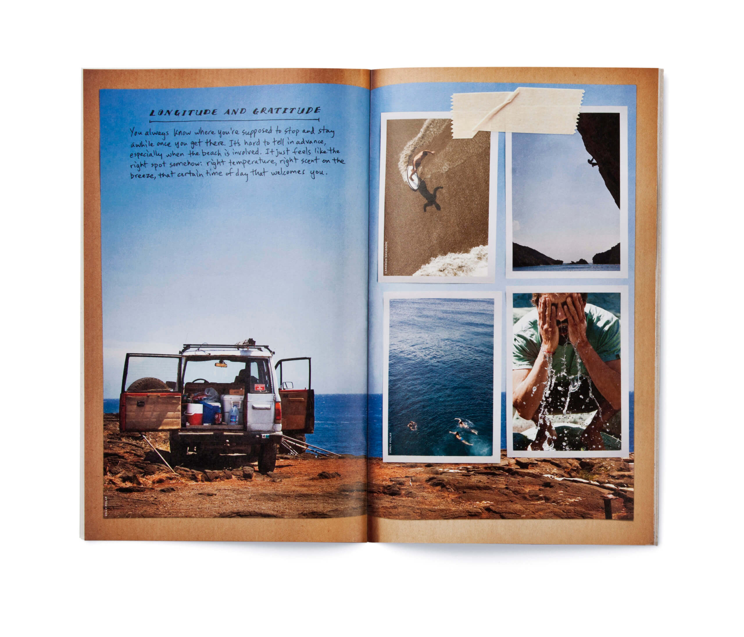
The imagery we used for the catalog had a raw immediacy to it. In some cases it was amateur photography, or the clothes weren’t front and center or the lighting may have sucked but the scene being shown was real. That’s what made it a prAna shot.
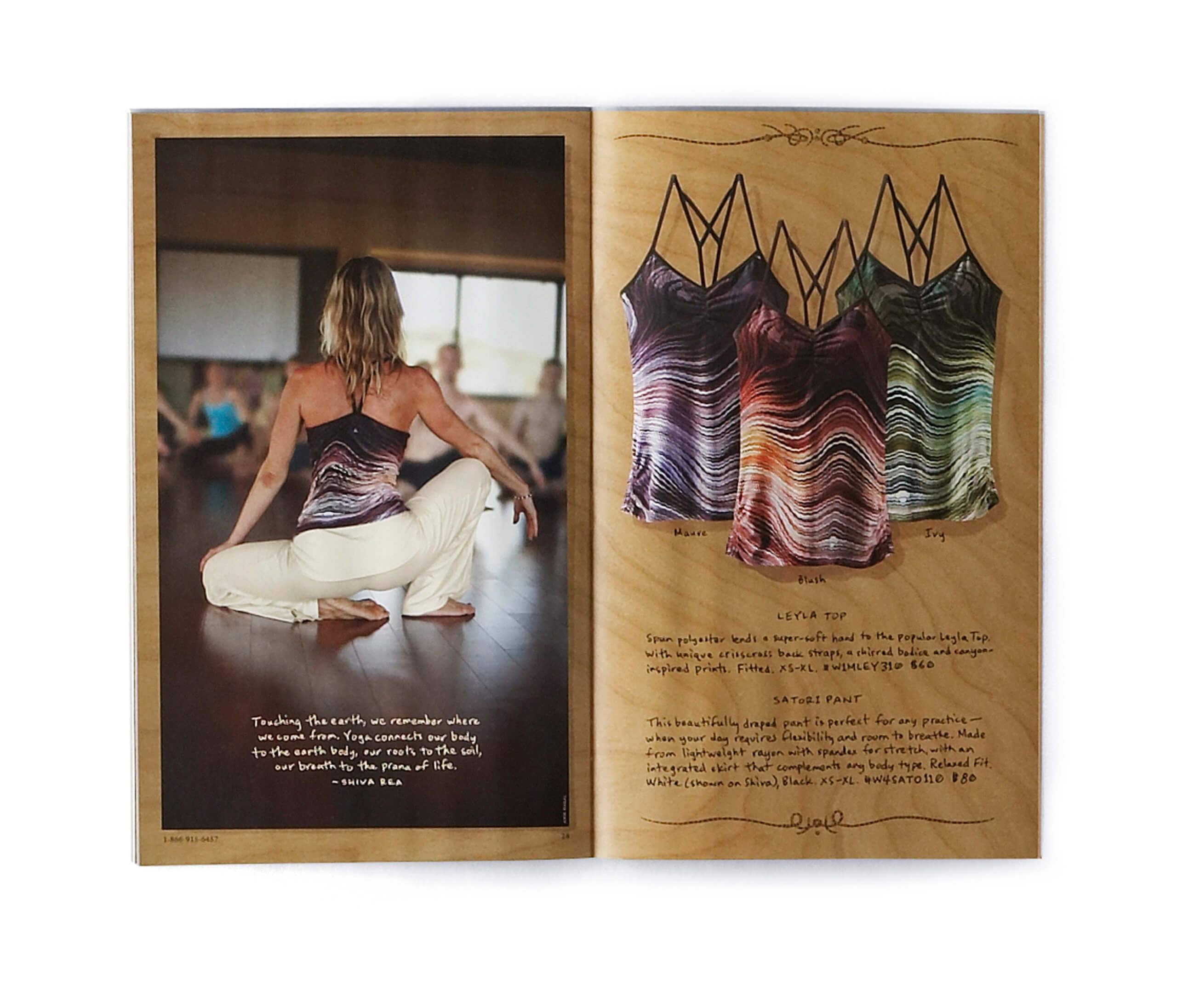
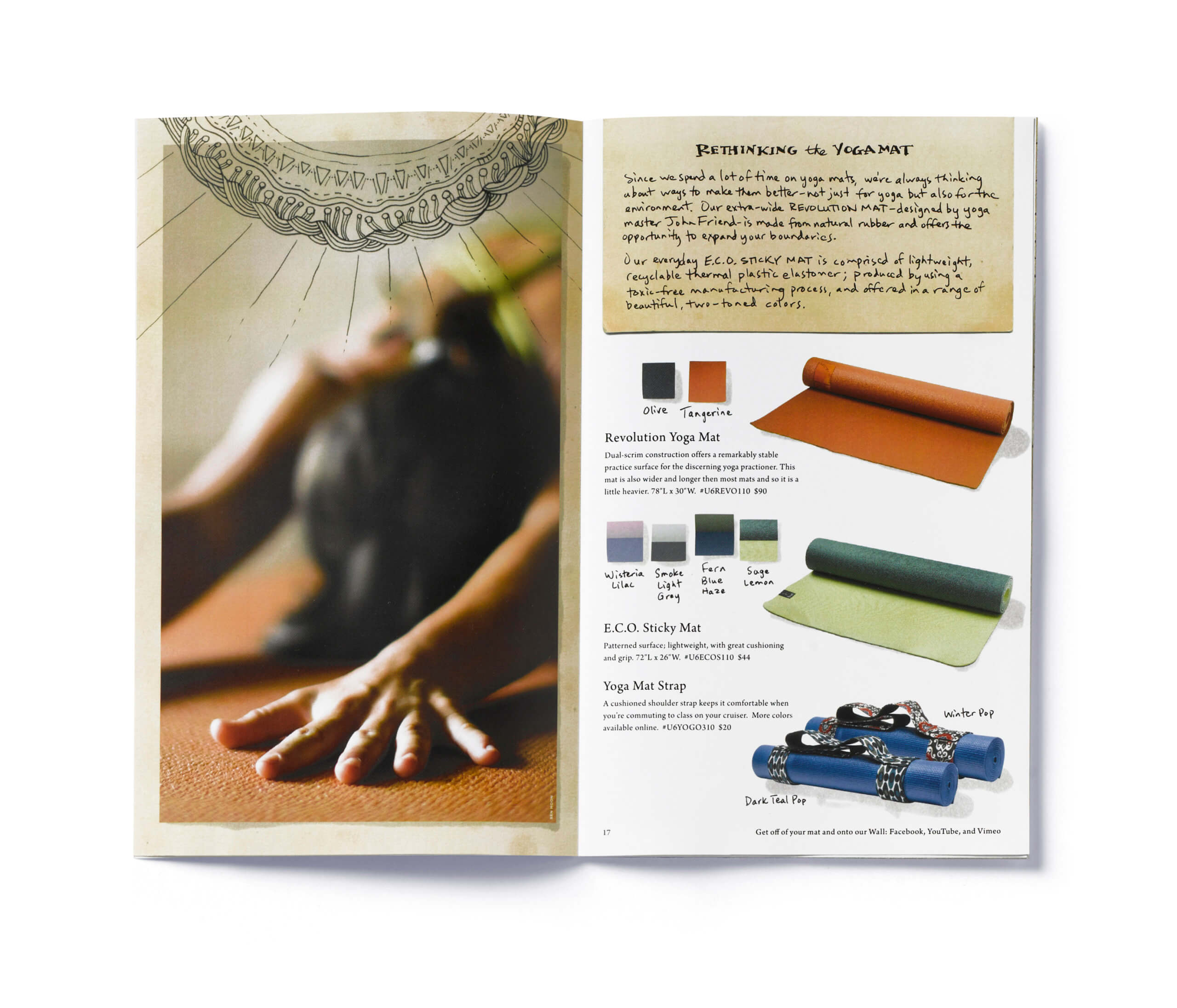
No handwriting fonts or no quick computer effects either. The copy blocks and color names were hand written, scanned, adjusted, placed into the design. Even the smallest copy edit required rewriting or photoshop work. If a color name was used more than once on a spread, an alternate version was used in order to retain the authenticity of it all being hand done. We didn’t rely on mechanical default shadows either. Every single shadow, for each clothing item, color, swatch, and paper edge was carefully drawn by hand over a light box, scanned, adjusted and put into the proper place. For us, this is the thrilling part of marrying strategy and design, to ensure that there are no lost opportunities to embody what is core to a brand.
Did it work? Indeed.
The company was bought by Columbia and is thriving. Did they eventually take the easier route and use handwriting fonts? Yes. And it’s ok because they can sit back a bit.
But getting brands to grow takes the design equivalent of ‘miracle grow.’ But this kind doesn’t come in a bottle.


